Books are more than a words

Showing posts with label cover wars. Show all posts

Sep 24, 2013

Cover Wars #12: Into the Still Blue by Veronica Rossi


Cover war is a blog segment where I present you the battle among the covers of the same book. It was an idea of Samee @ I want to read that.

This week "Into the Still Blue" war.


Summary.
Add to GOODREADS.      
Their love and their leadership have been tested. Now it's time for Perry and Aria to unite the Dwellers and the Outsiders in one last desperate attempt to bring balance to their world. The race to the Still Blue has reached a stalemate. Aria and Perry are determined to find this last safe-haven from the Aether storms before Sable and Hess do-and they are just as determined to stay together. Meanwhile, time is running out to rescue Cinder, who was abducted by Hess and Sable for his unique abilities. And when Roar returns to camp, he is so furious with Perry that he won't even look at him, and Perry begins to feel like they have already lost. Out of options, Perry and Aria assemble a team to mount an impossible rescue mission-because Cinder isn't just the key to unlocking the Still Blue and their only hope for survival, he's also their friend. And in a dying world, the bonds between people are what matter most. In this final book in her stunning Under the Never Sky trilogy, Veronica Rossi raises the stakes to their absolute limit and brings her epic love story to an unforgettable close.  


I still haven't read the second book in this trilogy, but I have to admit that I read Under the never sky, simply because I loved the cover a lot!
Sadly, the Spanish edition (the one that came to my country) was terrible! 
So, I wanted to see if the last book's has many changes and I found these 3 covers.
The 1st is the German cover, the 2nd is the UK cover and the 3rd is the US one.
I really like the three of them, but since I already know the story, I think that the US cover is the one that match the most. Plus, to be honest is the one that makes me want to read the book.
What do you think? 

 
 Well, I already said that. 
For me the winner is the US cover! 
Is perfect!

 
3

May 31, 2013

Cover Wars #11: Ashfall by Mike Mullin.


Cover war is a blog segment where I present you the battle among the covers of the same book. It was an idea of Samee @ I want to read that.

This week, since I just finished reading Ashfall by Mike Mullin, (which I liked it a lot) I think it's the time to use those pretty covers for my war of this week.
This week are 3 different covers.
1. The Kindle edition
2. The paperback edition
3. The spanish edition (mine).
*According to Goodreads*


Summary.

Under the bubbling hot springs and geysers of Yellowstone National Park is a supervolcano. Most people don't know it's there. The caldera is so large that it can only be seen from a plane or satellite. It just could be overdue for an eruption, which would change the landscape and climate of our planet.

For Alex, being left alone for the weekend means having the freedom to play computer games and hang out with his friends without hassle from his mother. Then the Yellowstone supervolcano erupts, plunging his hometown into a nightmare of darkness, ash, and violence. Alex begins a harrowing trek to seach for his family and finds help in Darla, a travel partner he meets along the way. Together they must find the strength and skills to survive and outlast an epic disaster.

 
Cover #1.
The color: So. Very. Pretty. Those shades of gray and... brown? are awesome! That made me think of ashes without reading the title, it was a very pretty election of color.
The models: Perfect as well. Plus, I love the way Darla's hair looks almost dirty (I see it that way). Yes, they are Alex and Darla!
The background: Is that a wall and a mirror? Nevermind! it seems destructed, it's the world after the volcano's eruption.
The font: It's very simple, but since this book isn't all shiny and happy, it is thoughtful.

Cover #2
The color: That blue is amazing! there is nothing else I can say, very eye catching! Sober and elegant.
The models: Are the hands the models? Oh, no sure. Thought it's exactly what the book can means, the joining between people to survive a tragedy... but... I would have prefered to see the hands of young people, like Alex, and those hands don't look young (believe me, I see hands everyday!).
The background: That's the ash covering all. Great!
The font: It's the same of the other cover, I think. So, I say the same.

 Cover #3
The color: What a wonderful thing! It makes me think of fire and darkness.
The models: No models, but the city looks creepy and sad. (Until now, I haven't realized a city could look sad).
The background: Again, thoughtful! The margins represent ash, or that's what I think. So, it's perfect.
The font: Well, since this cover is less sad and more fashionable, I think that the font could have been different. It's not bad, but CENIZAS in white and not as cool as CENIZAS in gray.

 
All of them are pretty. I had a difficult time picking one of them to talk about the book I was reading in my reading club. But after thinking about that a lot. 
The winner, my favorite cover of Ashfall is....

Stunning
...

Cover #1


3

May 23, 2013

Cover Wars #10 Unbreakable by Elizabeth Norris.


Cover Wars is a blog segment where I present you the different covers of a same book, and my favorite one of those.

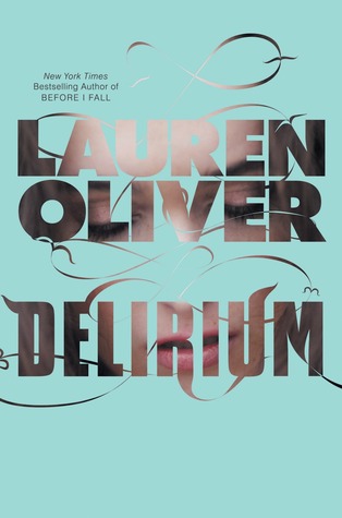
It's been a while since I had my last cover wars. Which was about all the covers for Delirium by Lauren Oliver (you can check it here). But now is just about 2 covers that take my breath away. Because both are awesome and pretty.
Yes, they're from Unbreakable by Liz Norris.


Vrs

Summary

24 meets the X Files in the amazing follow up to Unravelling.

Four months after Ben disappeared through the portal to his home universe, Janelle believes she’ll never see him again. Her world is still devastated, but civilisation is slowly rebuilding, and life is finally starting to resume some kind of normality. Until Interverse agent Taylor Barclay shows up. He’s got a problem, and he needs Janelle’s help. Somebody from an alternate universe is running a human trafficking ring – kidnapping people and selling them on different Earths. And Ben, with his unique abilities, is the prime suspect. To make things worse, Janelle learns that someone she cares about – someone from her own world – has become one of the missing.

Now Janelle has five days to track down the real culprit. Five days to locate the missing people before they’re lost forever. Five days to reunite with the boy who stole her heart. Can she uncover the truth before everyone she cares about is killed?

In this heart-pounding sequel to Unravelling, author Elizabeth Norris explores the sacrifices we make to save the people we love and the worlds we’ll travel to find them.


 Cover 1.
From the US.
That cover in person is absolutely amazing! I mean it! That was the first reason why I was dying to read this book.
The font: It's great, shiny and the color is matching!
The background: It makes me think of the countdown and it has something that also says "multiverse"
The legend: "Five days, Thousands at risk. One chance to save them all"... That describes the book perfectly, and reminds me of the countdown, too.
The models: They are great. I can easily picture "Jeanelle, Ben, Cecily and Barclay."
This cover is just perfect.

Cover 2.
From the UK.
Those eyes, those eyes, those eyes... Yes, that cover has me!
The font: I think it's too simple and the color is plane. It could have been better.
The background: The background is that hot guy or the broken crystal? Anyway, it's so pretty and eye catching. I love it!
The legend: "Five days to catch a killer. Five days to find the boy she loves. But what if they're the same person...?" Jesus! I wanted to scream when I read that. Yes, yes, a perfect way to make you read the book!
The model: What can I say. I love the boy. I wasn't really happy with Ben in the middle of  Unbreakable, but picturing him as the boy on the cover... oh my, I forgot it all.
So, this cover is perfect as well.


Both covers are amazing. 
I loved them.
They're eye catching.
They're perfect.
But just one captures the whole essence of the book, that's why the winner this time is.

Cover #1
The US cover of Unbreakable.
Because Cecily and Barclay were absolutely important in the book and they deserve to be there.
0

Dec 4, 2012

Cover Wars (9) Delirum by Lauren Oliver

 Cover Wars is a blog segment where I present you the different covers of a same book.

This week, I found some awesome covers of the book Delirium by Lauren Oliver, when I first read this book, it has just the light-blue cover, and I really liked it, but then I realized that around the world there were a lot of beautiful covers. Some prettier than others, but almost all of them reminds me of the story.
And here you are!

  1         2   3      4   5       6 7         9       10   11     12  13     14


Okay, all these covers ARE from Delirium!! 
See, there were even more, but some of them just changed the colors, so, I picked just these 14. 
And since they're so many, I don't remember to which editions they belong to, and decided to pick my favorite by the numbers. 
OMG! I can't even think about talking about all of them. That's why I'll pick my 3 favorites and my 3 least favorites.

Favorites:
Number 2: I love the model, she's so beutiful and look almost shy. She is like the Lena I always imagine.
Number 5: Gosh! That's so elegant, is the only word a can use to describe it.
Number 14: Love the colors and the pose of the model

Least favorites:
Number 3: I don't like the model at all, she's not the Lena I imagined.
Number 6: I don't even understand that cover, seriously?
Number 11: No comments. I simply don't like it.

And that is. Today I don't have a winner I have 3 favorites and nothing can change that. I also like the Russian cover (number 12), it's different and pretty, just like the cover #13, the problem with that is that the girl makes me think of Hana and I always thought the girl in the cover has to be Lena.

So, you like them all?
They're awesome, aren't they?
Have a beautiful and perfect week!!
Xo!

1

Sep 24, 2012

Cover Wars #8 Shatter me

Cover Wars is a weekly segment, an idea of Samee @ I want to read that.

Hallo reader!
It´s been a while since the last time I posted my Cover Wars #7
Ha! that's what I said last time. I have to admit that sometimes I forget about my own blog segments!
Well, I found these covers on Goodreads, and I am so happy to share them with you in case you haven't see them.

Let's start with Shatter me Cover wars!


1.       2.  


3.           4.   


5.       6.      


 7.         8.   


Holy mother of God! I'm thrilled to see such BEAUTIFUL covers for the same book!!! I can't believe I didn't know about some of them!
Now, this is my absolutely favorite Cover Wars of all the time!
If you want to see all this editions or add one to your list, just click here and maybe you find the one for your country, as I did.
La piel de Juliette!!! (Juliette's skin) I didn't even know that Shatter me will be published in Spanish, now, I need it!
But, start again.
As always, go in order.

Number 1: Amazing, the one that makes me want to read the book.
Number 2: Amazing, this is art.
Number 3: Amazing, but it's almost the same as The carrier of the mark
Number 4: Amazing, I love the number!!!
Number 5: Amazing, all is broken, It reminds me of Juliette.
Number 6: Amazing, seductive.
Number 7: Amazing, dark, mysterious.
Number 8: Amazing, I love the colors, but this is the weakest one.

Now, If I have to pick my favorite. This is becase, it's beautiful, indeed. It takes me to the story. It makes me want to devour the book. It's strong and stunning.
And of course, it was the first cover I saw.

And the winner of this little war is...
Cover Number 1. 
The US first edition!

Bravo! and bravo for all of them!
2

Aug 14, 2012

Cover Wars # 7 (Under the never sky)

Cover Wars is a weekly segment, an idea of Samee @ I want to read that.

Hallo reader!
It´s been a while since the last time I posted my Cover Wars #6
So, I decided I had to do it again, coz yesterday, wandering through Facebook I saw one of these amazing covers and I really needed to you to see it.


   &  

A lot, right?
Well, first I have to tell you this.
Cover 1: US
Cover 2: UK
Cover 3: Holland
Cover 4: Germany
Cover 5: Spain (Latin America)
Cover 6: France.

Okay, this is a totally a "covers eye candy" So, I cannot start saying what I didn´t like this or this, or that... because I like them all. Some time ago, I didn´t like the UK cover, I thought it was terrible, but after reading the book I realize that cover is truly realistic. Maybe that the one that match the most. But I feel the same with the Spanish one and the US one, they totally match the story... and then the French... Oh my! That´s Aria!!! But If I have to disqualify one of them. They´re two. The German and the Dutch. They're beautiful indeed, but I don't feel the essence of the story.
Well, but now I have to pick the best one. The winner of this little war. 
And that is. Because of the color, because it takes me into the book, because it makes me think of Aria and Perry. And because it´s FAN-FREAKING-TASTIC.

THE FRENCH COVER!!!!

Now, run and buy this book, anf if you speak French... order this pretty thing!
1